Part I
Five Images
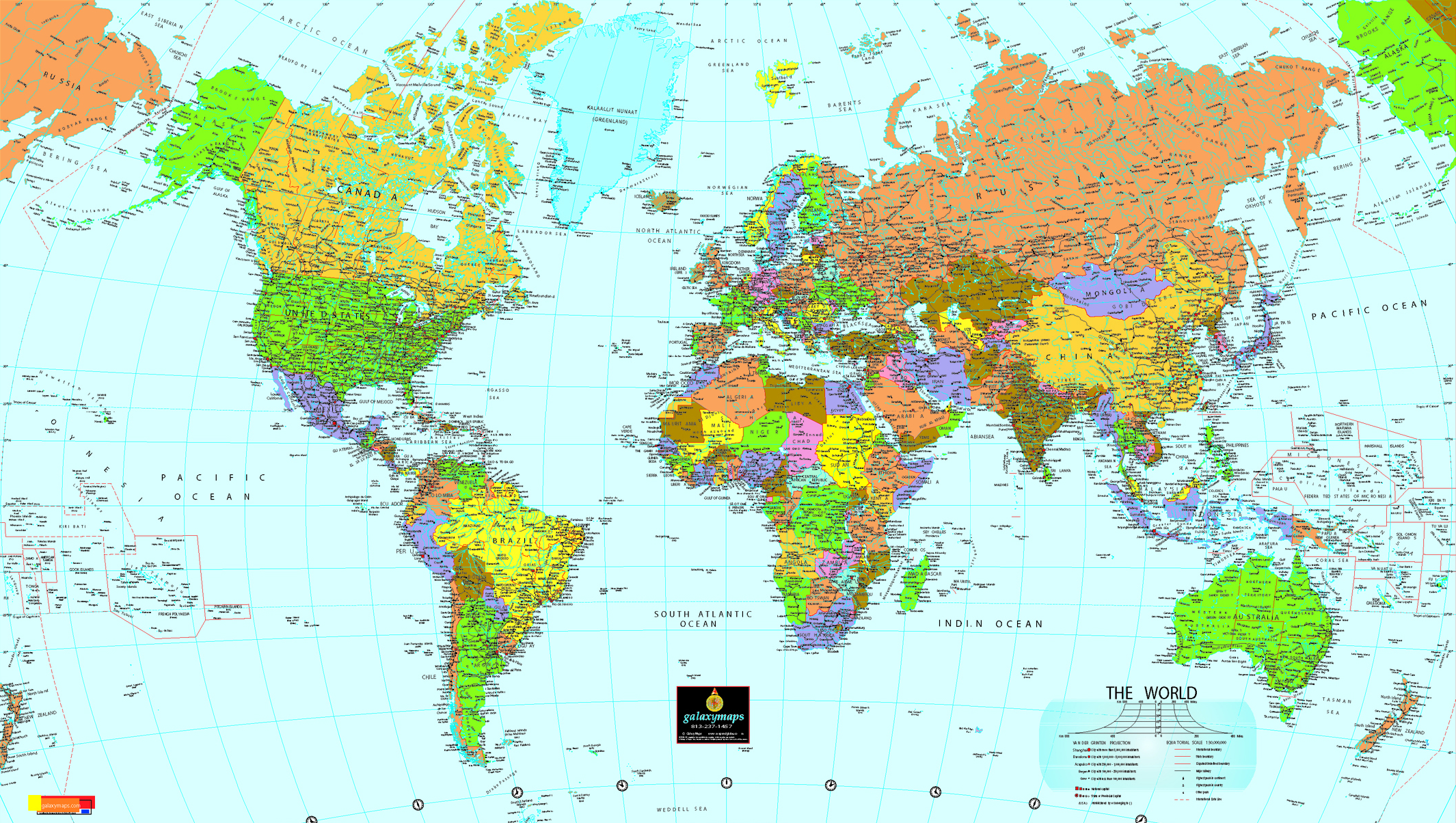
http://web.mit.edu/kenta/www/one/world-map.png1. The first image is a fairly standard, typical two-dimensional representation, or map, of the world. Unlike more geographically focused maps, this one is primarily designed to display political realities. The different nations of the world are represented in different colors, and presumably the purpose of the map is to serve as an instructional or referential tool for those wishing to learn or discuss nations of the world. Since the first maps were created the assumptions and prejudices of the cartographer has been represented in his or her work. Although it is physically impossible to reproduce a three-dimensional object in two-dimensional space with complete accuracy in every aspect, recent years have seen charges of far more serious, harmful manipulation leveled at cartographers. For instance, it has been claimed that the standard maps we see are skewed to make certain portions of the world (primarily Europe, the
2. The second image is familiar to most of us as the new ad campaign of Apple software. In the commercials the young man to the right (and he is always to the right, which is perhaps not entirely coincidental) is made to “represent” a MacIntosh computer (a Mac), while the older man on the left is supposed to be a personal computer (a PC). Through their dialogue it becomes clear that the Mac is being made to appear cooler, more fun, and more accessible. Presumably the process of degrading the PC and extolling the virtues of the Mac, often in highly humorous fashion, is meant to be reflective of the products themselves. It has been an extremely successful ad campaign, but one that makes a number of unusual claims. Despite their association, the human stand-ins are not computing machines. What is akin to an ad hominem attack in the commercial becomes ambiguously less so in reality. The truth value of these ads is hard to determine absolutely, but given that humans are discussing their own strengths and shortcomings and the viewer is meant to translate these discussions to inanimate machines, the ads cannot be absolutely true. They also are colored by their attempt to sell a certain product. Macs might be better (I doubt it), but we cannot really trust this fact just because Apple tells us so.
3. The third image is from a Marine Corps graduation ceremony. Although presumably this image was taken simply to document a given event, we do encounter very similar types of images frequently. Any armed services recruitment drive might well have an image very similar to this one. The reason why is simple: this picture is meant to inspire. The picture is virtually dripping with concepts of patriotism, discipline, service, protection, and strength. In many ways the image is not at all reflective of the real Marine experience; a more accurate view might be had by examining the cover of this morning’s New York Times. However, an accurate depiction of the realities that most soldiers face would not, perhaps, inspire the same kinds of values. We are meant to see the stoic, disciplined young men marching through the picture and be reminded of the protection we receive from these valiant soldiers. There is also a gendered message hidden deeply in the image, with nary a female face to be seen. In a sense the truth value of this image is quite high, given that this actually happened. Any ideologies being represented in the image are in part due to the reaction of the viewer.
4. This fourth image was actually the first thing to come up when I searched for “car” on Google’s image search. The blatant myths or ideologies being represented in it felt too strong to pass up. For starters, this is hardly a typical car; a small minority of the population is all that would be likely able to afford this vehicle. Then there is the woman. Why put a barely clothed model next to the car? To connect the two mentally, of course. If the advertisers can get viewers to transfer their impressions of the woman over to the car, then men (who are no doubt the target audience) would think of the car as sexy. If you have a car like this, you can get women like that. The entire image has a subtext of consumerism; it is designed to make you want to have the car, and most likely the woman as well. The truth value of the image is clearly flawed. There is no real or necessary connection between attractive females and expensive, shiny cars. The woman is only on the car because she is being paid to be so; she would not want the viewer just because he or she buys the car.
5. My fifth and final image surfaced several months ago as the tension first began mounting between Hillary Clinton and Barack Obama. Both Clinton and Obama had entered the race for the Democratic nomination for presidential candidacy, and it became clear that the two were testing the waters by firing small shots back and forth at each other. When viewing this image one is confronted with a number of ideologies (and more than a little curiosity about what they say to each other behind smiling facades) concerning our views on competition, politics, politicians, and even men and women. The image highlights our ideas of civility and how our politicians ought to be cordial despite being rivals. Both Clinton and Obama are well-dressed, polished, and appear generally happy. These are almost givens for what we expect from our public officials. The truth value of the image is almost certainly very low. In reality most political rivals are not very civil, and many times they probably detest one another. The perfection and polish we expect from them is unrealistic, and perhaps even ultimately harmful to themselves and to the general public.
Semiotic Analysis
For the Marine Corps graduation, the signifier is just a group of Homo sapiens marching and wearing standard clothing. The signified values are discipline, valor, bravery, protecting others, patriotism, defending the
For the woman and the car, the signifier is an automotive, combustion-based vehicle and a Homo sapiens wearing a few small articles of clothing. The signified values are sexy, cool, desirable, powerful, materialism, and objectification of women. The sign is that having a car like this will make you popular with women like her.
High vs. Low Art
Given my lack of a digital camera, I will be forced to resort to describing these images. The first, my example of high art, ought to need no introduction or complex description. My example of high art is also the most visible on campus: the Knowles Memorial Chapel. Architecture is clearly a form of art, and the construction of striking Christian houses of worship was, for centuries, the most important type of architecture in the western world. Although our chapel is no Cathedral of Notre Dame, it is still an artistic statement that is meant to be pleasing to the supreme, divine lord of all creation, much less human beings. Complete with its steeple, ringing bells, and stained glass windows, it is one of the focal points of campus. We illuminate it at night and I have seen people painting it on multiple occasions in the past. Weddings are a constant fixture inside, and others come to have their picture taken with the chapel as a background. The time and energy spent to create it (and keep it looking nice, as the scaffolding around it all summer attested) and its use in other artistic endeavors suggests it is high art.
My example of low art is one most Rollins students have encountered, but few have ever stopped and examined. In the
Part II
As media becomes increasingly diverse, with television, YouTube, and other video-based forms becoming dominant, our defenses become less and less effective. We are trained (whether we realize it or not) to defend ourselves against arguments presented to us in writing. We can, to an extent, extend these same defenses to certain kinds of televised arguments, like debates. However, video is in many ways non-propositional speech, and therefore does not obey the normal rules of argumentation. As such we are left defenseless.
The point of this is that mass media is dangerous. We accept most things we see and hear without sufficient questioning and consideration. Most traditional sources of mass media are only mass in one direction. Information flows from a single source to a vast number of receivers. There is nothing democratic about the way that television, radio, newspapers, and other one-to-many forms of traditional mass media operate. An oligarchy of individuals, such as Rupert Murdoch, controls what is said. It is true that any information might be preferable to no information, but we could easily be fed lies by the television and radio, and without another source to counter them we would readily believe all we were told.
Yet there is hope. The internet, although far from perfect, may serve as a means for one-to-many mass media to be replaced by many-to-many communication. This revolution is beginning, albeit slowly. Just as it took time for the printing press to redefine one-to-one communication into one-to-many communication, it will take time for the internet to become integrated enough into our societies to cause a change. Also, just as illiterate individuals were left out of the writing revolution, those without the ability to successfully utilize emergent technologies will be left behind in the democratization of mass media. Already bloggers have had profound political effects, and as long as the internet does not fall under governmental or private control, the degree to which mass media is democratic will continue to increase.


2 comments:
I am refreshed by and in accord with your distinctive perspective.
One of the points you initially insinuated towards in your opening statements of your first image analysis was that people often think in terms of the “political” or of the “official”.
As creatures inclined to organization, we often forget that this “map” we so conveniently partition is actually real land, and that if one were to stand between the boundaries of, for example, Switzerland and Italy, there would be no immediately recognizable difference. There would be no physical divide as we see on our maps, and while nobody would concede that they actually think a divide is physically there, subconsciously we have been politically conditioned to expect great disparities across states. We often forget that the world is a geographical composition of several simple land masses, and that boundaries are just concepts.
The implications of this subconscious habit of thinking in terms of political boundaries are enormous. Our politically-tilted conception of the world is a predecessor to divisiveness, because we think of Canada and the US as two separate entities, not as one unified land mass. Any politically imposed boundaries then become part of our perception of the world, and of course, political boundaries are at the mercy of man.
As you suggested, the way these man-made boundaries are represented on a map can be instrumental in our perception of our world. The manipulation of different elements of the map, including size (as you mentioned), the distance of a country from another, etc can shape our attitude towards the relationships between certain countries.
The principle of diminished truth-value can certainly be applied here. The angle at which a map is represented, the choice of which region to distort and the manner in which to distort it can all jeopardize objectivity.
The analysis of the world map is an amazing example of how subtle representation can really be. People look at maps all the time from the time they are little kids. Maps are considered to be an accurate mimesis of the world and are trusted blindly. Seeing such a staple as something able to be manipulated to show peoples views and prejudices makes you look at many other things in a different light. Almost anything that involves the human touch is susceptible to subjectivity. Even things that are meant to be objective are still tainted by the viewer’s, if not also the creator’s, views and ideas.
The point made in part two is also very relevant. The “masses” have little to no control over what they see on TV. Not only do they not get to pick what type of information they find here, they also have no way of knowing where the information came from. Images and picture shots can be manipulated to say very different things then what actually took place. Have you ever seen something and grossly misunderstood what it was? Now imagine if someone had the control to deceive you in the same way every time you turn on the television. It is a scary concept. It is our job as responsible Americans to make sure that we find a way to get as accurate and objective information as we can.
Post a Comment